Building reports in Cognos can be a fairly arduous process. A mistake early on in the development can cause some headaches later on. Quickly and efficiently building reports is best, but what if you have to go back and fix something?
Fixing Extended Data Items
One of the most common problems I run into is people using extended data items to build a dimensional report. Once the data item has been created, it can’t easily be changed. What if you need to change the level, or even hierarchy, the item is based on? You’ll need to delete and rebuild it from scratch. Instead it would be easier to convert it to a full expression.
There is a function that allows this, but it is normally inaccessible. We can easily reveal it by using the developer toolbar in Report Studio. I prefer using Firefox, that’s the browser in the animation. Simply copy the following code into the console and run it.
document.getElementById('mnuToolsPopup').firstChild.firstChild.appendChild(document.getElementById('mnuConvertV5DataItems').parentNode.parentNode)

As you can see in the animation, the option magically appears under tools, and will convert every extended data item into a normal data item. It’s worth mentioning that this is not supported by IBM, and it is not possible to convert data items back into Extended Data Items, so tread carefully with this.
Avoid Extra Master/Detail relationships by using list headers
I’m not a big fan of using section functionality. It works by creating another list, a list in a list, connected with master/detail. In some cases Cognos can handle this efficiently; with master detail optimization and efficiently built queries. In most cases however, Cognos will generate an extra query for each separate detail.
How can we avoid this? By careful grouping and setting of list headers/footers, we can replicate the appearance of a sectioned report. In the image below, we have two identical looking lists. One is using the default section function, and one is some very clever formatting. Can you guess which is which?

Year grouped, removed from the list, headers and footers set, list header set to “start of details”, and extra rows/fields included for the padding effect. All small details that go a long way into making things look right.
The report xml is attached below, but can you figure it out yourself?
Caching charts to speed up run time
This is actually something I’m not too proud of. At my current client we have a few reports with embedded graphs. Hundreds upon hundreds of embedded graphs. Each graph can take around 300 ms to render. This increases the runtime of the report from 30 seconds, without graphs, to around 9 minutes. How can we get around this? Well, in this case, the graphs were fairly simple – a colored bar showing 0-100% against a light gray background. There are a few different variations – a 12 pixel tall vs a 6 pixel tall, and depending on the type it can be blue, green, or purple. In total there were 606 possible graphs (it’s actually 602 as the 0% graphs all look identical, but let’s not get technical here).
To start, the names of the graphs had to be consistent. Bar55B.png would be a bar set to 55% and is colored Blue. We can then use an image item with the source set to layout expression. ‘\images\charts\Bar’+number2string(floor([Measure]*100))+’B.png’. Each row would generate the image tag, and wouldn’t have to take the time to actually build the graph image. But how can we generate those images?
The easiest way is to use a numbers dimension. Don’t have a numbers dimension? Use a date dimension – you just need to massage a date dimension to work the way you want. For example, on the samples I’m using _days_between([Sales (query)].[Time].[Date],2010-01-01) and filtering that <=100.
Build the graph in each row, and run it to make sure. The output should look like this:

But saving each of those images would be tedious, so how can we automate it? Modern web browsers have a number of options. I’m using an addon called Save Images which will automatically save each image from the tab to a specified folder. This addon will number the images starting at 1, so it’s important to sort the list so the 0 is at the very end. This way you can modify Bar101 to Bar0, instead of having to subtract 1 from each graph. The addon saves and names the images in the order they appear in the output, so it works well for this purpose.

Once the images have been saved, we need to do a bit of post processing.
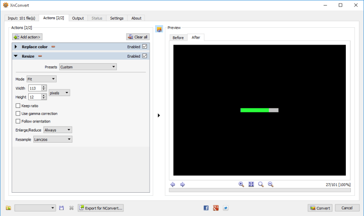
First, rename Bar101 to Bar0. Now let’s notice something interesting the height of the image is 16, but we need 6 or 12. To fix this, we can use a batch image processor. For this we can use an application like XnConvert. With XnConvert we can modify the size and colors of the graph. The color picker offers a number of ways of selecting the desired colors, including a color picker.
Simply select the color to change and the color you want.

Next we resize

Finally, renaming:

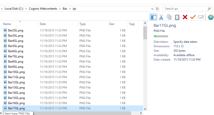
This will take the original name, BarN, append GL (green large).
And when we press the convert button…

We can repeat, very quickly, for every variation we need. In my case it only took 6 rounds of changes, about a minute in total.

Now instead of relying on Cognos to generate hundreds (if not thousands) of graphs, we simply use an image item with the source set to a report expression.
‘..\images\Bar\ipr\Bar’+number2string(floor([Query1].[Percentage]*100))+[Color letter] +[Large or Small]+’.png’
The difference in runtime is phenomenal. First we don’t have a master/detail relationship any more. So that’s an additional N db connections that aren’t being run (yes, I know M/D optimization negates that, but that only works in DQM and it’s spotty). And most importantly, that’s thousands of images Cognos doesn’t have to generate (300 ms * 1500 images = 7 minutes).
section-or-formatting.txt (747 downloads)
graphs.txt (665 downloads)
Your “graphs.txt” link contains a report definition, but “section-or-formatting.txt” just gets me a plain-text copy of the article above and not a report definition. Is that intended?
Definitely not intended. Once I get back to my personal laptop I’ll replace that with the correct version.
And that’s fixed now. Thanks for the heads up.
Hey Paul, Always great and useful stuff in here. I’m curious if you discovered a way to enable the menu item in C11 to “fix” the extended data items. Or found another way to do it.
Hi Johan, press ctrl-alt-m, and you should get the menu back. Do it from there as normal.
Hi Paul,
Is there a way to add the time-stamp to the Report name (Not inside the report studio, report title)?
Thanks,
Beena
Do you mean as it appears in Cognos connection? I don’t believe there is.
Hi Paul,i’ve tried to modify and enable the hidden menu for disabling extended data items in cognos analytics 11.1 (with chrome) but the CTRL+ALT+M doesn’t work.
Have you noticed this?
thanks and Happy New (cognos) Year 🙂
Unfortunately the ctrl-alt-m menu has been removed in 11.1. The best solution I have at the moment is to open the xml of the report and change
There’s an RFE asking IBM to add a way to disable extended data items again, but it only has 27 votes. Please vote on https://www.ibm.com/developerworks/rfe/execute?use_case=viewRfe&CR_ID=98150 and get all your friends to vote on it.