Guest Post: On Cognos Reports Performance Improvement

One of the tasks I’m hired to do quite often is to analyse why a report (or a group of reports) is loading slowly, and how could this be improved. The good news are, when a report runs for a very long time, there is almost always something we can do to improve it. But first, we must analyse what causes the report to run long.

The first thing we want to do is to rule out the query as the culprit. That is, we want to see how long it takes to get the report data from the database. This is best done by getting someone who is well versed in SQL or MDX to write a query that will pull the relevant data from the database. Many BI developers have sufficient knowledge of SQL, but in case you don’t, get a DBA to help.

One might ask – why not just take the SQL Cognos generates, and run that against the database. The answer is that we are trying to figure out what Cognos does wrong, and that includes the query generation. We need to compare what Cognos does with a well structured query.

If your manual query takes a long time to give results, it means that the underlying database has a hard time supporting your query. There could be many reasons for that. First of all, check that your tables are properly indexed and, if necessary, partitioned. Again, developers with gaps in knowledge in terms of DB tuning will do well to consult a DBA. If you are aggregating large amount of rows, or creating many joins, maybe an aggregated table or a materialised (Indexed) view will solve the problem. If you are doing multiple aggregates based on a few million rows, perhaps a Dynamic Cube would be a good bet, or you could try building an OLAP cube to support your reporting needs (Almost any cubing solution would be better than Transformer, but if push comes to shove, Transformer could be better than nothing).

If your data source is OLAP, and a query takes long to come back, it probably means you might want to design your cube differently. The most important tip I can give you here is to avoid nesting in as much as possible – try to hierarchise the nested columns under one single hierarchy, it will also help with aggregates. A rugged hierarchy is often preferable to a full cross join between different hierarchies, even when nonempty is defined in the query.

If your manual query returns within a reasonable time, it’s time to compare it with the Cognos generated query (Obtain it from tools->Show generated SQL/MDX). Just skim through the Cognos query and see that there aren’t any major differences. If there are, it could be your framework model is problematic.  Run the Cognos generated query against the DB – how long does it take to come back? If much longer, then your model is probably at fault. The most usual culprit in cases like these are ill defined relations.

If the query Cognos generates is fine, we’re probably looking at some processing done on the result set. There are several of those, the common ones are master-detail relationships, chart generation and crosstab generation. There are ways to improve master-detail relationships over CQM (Follow this link, and also make sure that you are sectioning by a single key field), but ultimately, a DQM model would optimise master-detail relationships better than any wizardry. Crosstabs and charts over relational are rendered by creating mini-cubes on the server side, these may take some processing – again, the best cure is DQM, or creating a dimensional data source. If you are rendering many charts, the charting engine will queue some of them – not a lot to be done here other than increasing number of connections to the Graphics Service, minimising the amount of charts by using matrix rows/columns where appropriate or by loading the serially, or creating a RAVE based chart that spans multiple charts together.

These are the basics. There are obviously many cases which aren’t covered here, but that should give you the first-aid steps. If you tried all this and your report still slugs, then it is time to call the cavalry in.


Nimrod (Rod) Avissar is a Cognos expert, with a penchant for specialized UX solutions. Feel free to drop me a line! (LinkedIn).
 

Guest Post: A New Take on Date Range Prompts

Since version 10.2 of IBM Cognos BI Suite, IBM included an API to access and manipulate prompt objects. Since prompt objects are the main instrument we use to allow users to communicate with a report (Interactivity or user selection), being able to manipulate them however we see fit can change user experience dramatically for the better. There are countless examples of how the prompt API can be used to achieve this. For example, dynamic defaults: Suppose you have two prompts, for region and for products. You want the default product selected to be the best selling product in the region selected. With prompt API, this can be achieved easily.

In this post I’d like to showcase one of the first solutions I ever wrote using Prompt API, because it was one of the things I wanted to solve for a long time.

Every so often we add “from date” and “to date” prompts to a report, to use for filtering the report output to show only data from the date range selected. The problem is, most users and most use cases don’t require the sort of flexibility a date range offers: most users will not run their sales-per-branch report between April 23rd and May 2nd, for instance, because it’s an arbitrary chunk of dates. Instead, users are likely to filter dates for last month, this MTD, QTD, YTD, last week and so on. So, basically, set, standard, comparable time frames. And sometimes the date range prompt can be replaced with a drop down list of such pre-set ranges, but other times, users ask to still have the flexibility of choosing to and from date, but nonetheless, still mostly use the set, comparable ranges.

Now, in order to select last month’s dates with two date prompts, your average user will need 6 clicks: One to open from date calendar, one to page back to last month, one to click on “1”, and the same process with the “To date” prompt. For YTD, they might need more. That’s a lot of clicks. Also, developers often have to write scripts to get the default value right, and because these date prompts are never done in a centralised, reusable manner, they end up writing a script for each report. I have long fought the war on developers wasting time by doing things more than once, and this case is no different. Even if reports require different default times, the solution can still be generalised, and therefore made reusable.

My solution uses JavaScript and Prompt API to add to the date prompt functionality. Here is how it works:

Date Solution

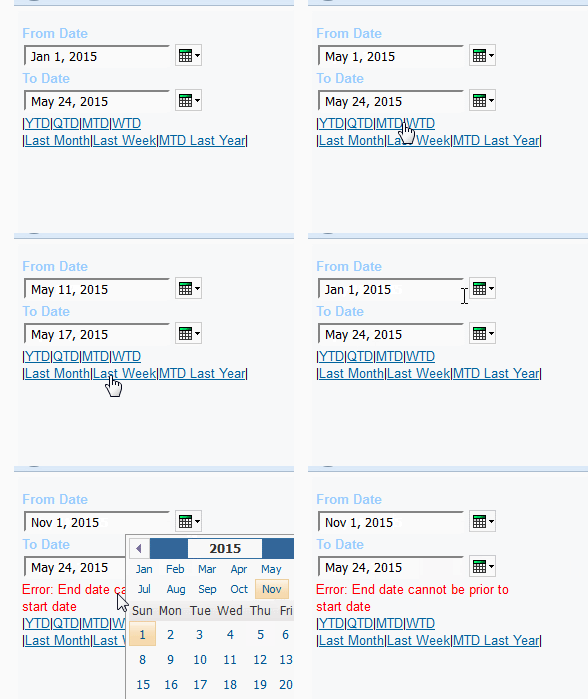
I’m using two date prompts, and adding 7 pre-defined links, which, when clicked, fill in their respective dates. So, for example, clicking on MTD will set the from date prompt to the 1st of the current month, and the to date prompt to today’s date. There’s also a verification mechanism in place to ensure that from date is always earlier than to date, or equal to it.

But how do I make this solution generalised? Let’s take a look at the report studio report:

RS Look

The bit in blue is the error message the user will get if they choose an end date that’s prior to the start date. The bit in blue is a text that should be replaced with another text – containing just one number between 1 and 7, corresponding with a dynamic ate range.  “1” is YTD, 4 is WTD and so on.

Now, if you drag in a layout reference object to this interface, here’s what you’ll get:

override

You can override&replace the warning message and the default text. So, if the default for a certain report is “last month”, you’ll override “Defaults”

replace

Drag in a text item and insert “5”

default set

When you run the report, the default would be last month:

final result

This way you can set a different default value for each report in a reusable manner.

I’m attaching the XML, of course, but pay attention to these caveats:

1. The script has seven preconfigured date ranges. You can change them or add to them as you require, and use the general example in the code, but it requires some knowledge of scripting. Unfortunately, I will not be able to provide support for such customisations.

2. If you’re relying on my script to manipulate weeks, pay attention that my script assumes Monday is the first day of the week. Israelis especially, this means you’ll have to change this logic (Weeks in Israel begin on Sundays).

3.This is 10.2.2 – You can downgrade it to 10.2.x by changing the version number at the top.


daterange.txt (9374 downloads)


Nimrod (Rod) Avissar is a Cognos expert, with a penchant for specialized UX solutions. Feel free to drop me a line! (LinkedIn).


Tab Solution That’s Easy to Maintain Without Code – Guest Post

“How corrupting boredom is, everyone recognizes also with regard to children. As long as children are having a good time, they are always good. This can be said in the strictest sense, for if they at times become unmanageable even while playing, it is really because they are beginning to be bored[…]Adam was bored alone; then Adam and Eve were bored en famille. After that, the population of the world increased and the nations were bored en masse. To amuse themselves, they hit upon the notion of building a tower so high that it would reach the sky. This notion is just as boring as the tower was high and is a terrible demonstration of how boredom had gained the upper hand. Then they were dispersed around the world, just as people now travel abroad, but they continued to be bored” (S. Keirkegaard, the Rotation of Crops).

I like writing nifty solutions for Cognos, which look good, work well, and add a necessary functionality. Tabs for Cognos reports (Not Active Reports, where tabs exist out of box) are a great demonstration for such functionality: It’s a necessary functionality, and when done properly, they make a report look wonderful.

However, I get bored doing the same thing over and over. When writing a tabbing solution, the principal is always the same: There are the tabs themselves, which are essentially links to be clicked on, and when clicked, there are the contents which need to be either hidden or shown based on the tab that was clicked.

Every now and again a developer who may not be very well versed in HTML, JavaScript and/or CSS would ask me to add, remove or change a tab, or change the style of a tabbed menu, or any such thing. To me, this is boring, and as Kierkegaard noted, boredom is corrupting – indeed, it is the root of all evil.

What needed to be done, then, was to come up with a tabbing solution that allows developers to add, remove and edit tab contents and tab styles without needing to write a single letter of code. The scripted solution needed to be generalized so that developers would be able to use Cognos built-in features to control all aspects of tabs. In other words, I needed to write a tabbing solution that would be a piece of cake to maintain, leaving me with more free time to get bored productively in Cognoise forums.

POCT (=Piece of Cake Tabs) is just that solution. It requires no coding to add, remove, or edit the content a tab. It allows the user to style the tabs using nothing but Cognos built in features. Basically, once you set the solution up, you never have to open an HTML item again.

Let’s look at the page structure:

POCT

Under “Tab Headers” HTML Item, one would simply drop in text items one after the other, each containing the name of the tab (The text that would be written in the tab).

Under “Tab Content” HTML Item, one would create a block for each tab, and drop in the necessary objects for each tab. The uppermost block is the content for the leftmost tab header, and so on – tab headers from left to right, content blocks from top to bottom.

Under “Style” HTML Item there are 3 table cells. One can style them as one wish. The leftmost cell represents how a selected tab would look. The middle one represents the styling of a tab which isn’t currently selected. The rightmost cell controls how a tab looks on mouse over. You can also control the look of the entire tab row, by highlighting the blue table cell where the tab headers are and changing its design to modify the design of the tab row.

And that’s it.

Want to add a tab? Add a text item and a block accordingly. Want to change the content of a tab? Just change the content of a block. Want to remove a tab? Remove the header text item and the corresponding block. And styling is truly piece of cake.

Report XML (10.1) – you can either use that as base or copy the main block and anything in it to any report. This was tested on all Cognos 10.x versions, and should work fine on 8.4.x.

POCT-XML-101.txt (5556 downloads)

Nimrod (Rod) Avissar is a BI Front-End Specialist, with a penchant for specialized UX solutions (LinkedIn).