Different Drillthroughs for Graph Elements

I recently received an interesting problem. A multi bar graph needed to have drillthroughs pointing to separate reports. The requirement is to have it seamless for the end-user, no transitional screens. If the user clicks on the revenue bar, it needs to go to the revenue report. If they click on the planned revenue bar, it goes to the planned revenue report.

As the product is currently built, drillthroughs are defined on the graph level, not a measure level. Let’s take a look at the actual HTML being generated:

separateDrillsDefaultChart

<area 
  dttargets="<drillTarget drillIdx=\"2\" label=\"Planned revenue\"/><drillTarget drillIdx=\"3\" label=\"Revenue\"/>" 
  display="914,352,803.72" 
  tabindex="-1" 
  ctx="27::22::18" 
  title="Year = 2010 Revenue = 914,352,803.72" 
  coords="157, 309, 157, 174, 118, 174, 118, 310, 157, 310" 
  shape="POLY" 
  type="chartElement" 
  class="dl chart_area" 
  ddc="1" 
  href="#"
>

In this example, I have a chart with two bars. In the area of each bar, the dttargets is defined with both drills. The drills themselves I’ve named the same as the data item of the measure. We can then use JavaScript to extract the dttargets string, match the label of the drill to the data item name, and place the correct one in there.

/*
 * This will loop through every chart and replace multiple drill definitions with one. 
 */
paulScripts.fixChartDrills = function(chartName){
  var oCV = window['oCV'+'_THIS_']
  , areas = paulScripts.getElement(chartName).parentNode.previousSibling.getElementsByClassName('chart_area')
  , areasLen = areas.length
  , areaDataItemName
  , drills=[]
  , dtargets=[]
;

for (var i=0;i<areasLen;++i){
  if(!areas[i].getAttribute('dttargets')) continue;
  areaDataItemName=oCV.getDataItemName(areas[i].getAttribute('ctx'));

  drills = areas[i].getAttribute('dttargets');
  dtargets =drills.split('>');

  for (var j=0;j<dtargets.length;++j){
    var regexp = /label...(.+?)."/g;
    var match = regexp.exec(dtargets[j]);

    if(match&&match[1] == areaDataItemName) areas[i].setAttribute('dttargets',dtargets[j]+'>');

  }

First we’re finding the chart that we want to do this on, and finding the area map. We loop through the areas, skipping the ones that don’t have any dttargets (like the legend or labels).
For each area with a dttarget, we get the source data item name. Fortunately for us, there’s a useful Cognos JavaScript function to do it! Then a little hackey JS magic to get the label for each individual dttarget we can finally match and replace the dttargets attribute.

Let’s see it in action!
separateDrills

Now it’s very important that the drillthroughs have exactly the same names as the data items. If they don’t do that, this script won’t work – but of course that wouldn’t stop you from using different logic. I built this in Cognos 10.2.2, but I have no reason to think it’s not backwards compatible. The full JavaScript, including the paulScripts.getElement can be found in the report XML below.

separateDrills.txt (1050 downloads)

A few Report Studio tricks

Building reports in Cognos can be a fairly arduous process. A mistake early on in the development can cause some headaches later on. Quickly and efficiently building reports is best, but what if you have to go back and fix something?

Fixing Extended Data Items

One of the most common problems I run into is people using extended data items to build a dimensional report. Once the data item has been created, it can’t easily be changed. What if you need to change the level, or even hierarchy, the item is based on? You’ll need to delete and rebuild it from scratch. Instead it would be easier to convert it to a full expression.

There is a function that allows this, but it is normally inaccessible. We can easily reveal it by using the developer toolbar in Report Studio. I prefer using Firefox, that’s the browser in the animation. Simply copy the following code into the console and run it.

document.getElementById('mnuToolsPopup').firstChild.firstChild.appendChild(document.getElementById('mnuConvertV5DataItems').parentNode.parentNode)

Convert to V5 Data Items

As you can see in the animation, the option magically appears under tools, and will convert every extended data item into a normal data item. It’s worth mentioning that this is not supported by IBM, and it is not possible to convert data items back into Extended Data Items, so tread carefully with this.

Avoid Extra Master/Detail relationships by using list headers

I’m not a big fan of using section functionality. It works by creating another list, a list in a list, connected with master/detail. In some cases Cognos can handle this efficiently; with master detail optimization and efficiently built queries. In most cases however, Cognos will generate an extra query for each separate detail.

How can we avoid this? By careful grouping and setting of list headers/footers, we can replicate the appearance of a sectioned report. In the image below, we have two identical looking lists. One is using the default section function, and one is some very clever formatting. Can you guess which is which?

List Headers vs Sectioning

Year grouped, removed from the list, headers and footers set, list header set to “start of details”, and extra rows/fields included for the padding effect. All small details that go a long way into making things look right.

The report xml is attached below, but can you figure it out yourself?

Caching charts to speed up run time

This is actually something I’m not too proud of. At my current client we have a few reports with embedded graphs. Hundreds upon hundreds of embedded graphs. Each graph can take around 300 ms to render. This increases the runtime of the report from 30 seconds, without graphs, to around 9 minutes. How can we get around this? Well, in this case, the graphs were fairly simple – a colored bar showing 0-100% against a light gray background. There are a few different variations – a 12 pixel tall vs a 6 pixel tall, and depending on the type it can be blue, green, or purple. In total there were 606 possible graphs (it’s actually 602 as the 0% graphs all look identical, but let’s not get technical here).

To start, the names of the graphs had to be consistent. Bar55B.png would be a bar set to 55% and is colored Blue. We can then use an image item with the source set to layout expression. ‘\images\charts\Bar’+number2string(floor([Measure]*100))+’B.png’. Each row would generate the image tag, and wouldn’t have to take the time to actually build the graph image. But how can we generate those images?

The easiest way is to use a numbers dimension. Don’t have a numbers dimension? Use a date dimension – you just need to massage a date dimension to work the way you want. For example, on the samples I’m using _days_between([Sales (query)].[Time].[Date],2010-01-01) and filtering that <=100. Build the graph in each row, and run it to make sure. The output should look like this: graphs

But saving each of those images would be tedious, so how can we automate it? Modern web browsers have a number of options. I’m using an addon called Save Images which will automatically save each image from the tab to a specified folder. This addon will number the images starting at 1, so it’s important to sort the list so the 0 is at the very end. This way you can modify Bar101 to Bar0, instead of having to subtract 1 from each graph. The addon saves and names the images in the order they appear in the output, so it works well for this purpose.

save images

Once the images have been saved, we need to do a bit of post processing.

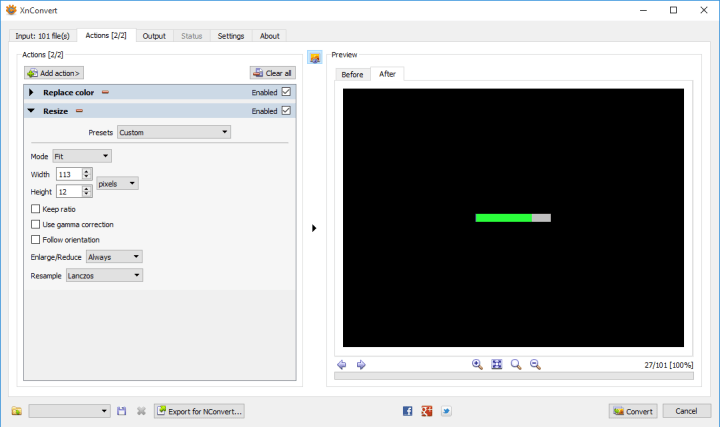
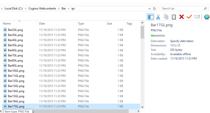
First, rename Bar101 to Bar0. Now let’s notice something interesting the height of the image is 16, but we need 6 or 12. To fix this, we can use a batch image processor. For this we can use an application like XnConvert. With XnConvert we can modify the size and colors of the graph. The color picker offers a number of ways of selecting the desired colors, including a color picker.

Simply select the color to change and the color you want.
xnconvert colors

Next we resize
xnconvert resize

Finally, renaming:
xnconver rename
This will take the original name, BarN, append GL (green large).

And when we press the convert button…
xnconver rename

We can repeat, very quickly, for every variation we need. In my case it only took 6 rounds of changes, about a minute in total.
xnconvert done

Now instead of relying on Cognos to generate hundreds (if not thousands) of graphs, we simply use an image item with the source set to a report expression.
‘..\images\Bar\ipr\Bar’+number2string(floor([Query1].[Percentage]*100))+[Color letter] +[Large or Small]+’.png’

The difference in runtime is phenomenal. First we don’t have a master/detail relationship any more. So that’s an additional N db connections that aren’t being run (yes, I know M/D optimization negates that, but that only works in DQM and it’s spotty). And most importantly, that’s thousands of images Cognos doesn’t have to generate (300 ms * 1500 images = 7 minutes).

section-or-formatting.txt (729 downloads)
graphs.txt (648 downloads)

Takeaways from IBM Insight 2015

Unlike previous years, this year was almost all work. I didn’t really have any free time (what little time I had was devoted to the fine art of inebriation, with many thanks to Motio for doing there part), so I couldn’t give a daily overview. On the flip side, I did have much greater access to the IBM developers this time, and had the chance to ask a few of my most urgent questions. This is actually the primary reason for me attending IBM Insight – the chance to look them in the eye and hopefully get some straight answers. There were a few people who dropped by the booth to try to chat, but apparently I was never there. Sorry! I have a tendency to wander around and collect pens/USB Sticks/tchotchkes for the kids. If it’s still relevant, drop me a line and we’ll chat.

I’m sure everyone is wondering about the new version of Cognos. The most important thing first. I do not need to change the name of my blog – IBM is sticking with the Cognos moniker. It is now christened Cognos Analytics, but for the purpose of abbreviations I’ll just call it C11.

The authoring environment has gone under a major re-factoring. The Report Studio we all know and love (well, I love it) has undergone a substantial face-lift. The Report Viewer has also undergone many changes. Previously an authored report was essentially static. You could, in theory, write JS to manipulate objects on the page but that always came with some level of risk. Dashboarding and datasets have also gone under the knife and have emerged substantially improved.

Unfortunately I don’t have access to the C11 demo yet. This any screenshots will be from Youtube videos. As soon as I do get access, I’ll try to publish some articles with original media.

Authoring
The immediate reaction is that it seems to be a completely new tool. The menu bar at the top is gone, clicking on certain regions opens up a circular context menu, and the toolbox is actually arranged in a logical format.

This is actually still using rsapp.htm. In theory, all of the same functionality is still there. The locations for the menu options have been moved, and this time they actually feel logical. To get to the report properties, for example, you don’t go through the File menu option – you actually click on the report object. Additional report properties have also been moved here, so it does make things a little easier to find. Moving things around does have its drawbacks – in the hands-on demo it took me a minute to find the location to switch from an individual page to a specific query. A few other features took me some time to find.

When a table or block is dragged in, a plus icon appears in the center. Clicking on that creates a radial context menu.

The items that appear in the menu are the items from the “pinned” section in the toolbox. Easily changed by report authors.

Another very positive change is the query explorer now shows all objects associated with that query. Expand a query, and jump to the object by clicking on it. The more complex reports tend to accumulate a lot of QueryNs, so this should speed cleaning up the reports.

Reports built in this new RS version will automatically open in the new Report Viewer (this is a property on the report level which can be changed). The new report viewer should work with the Prompt API (though the hands-on was getting an error when I tried), but all other JS is likely to cause issues. This should be okay, as a majority of the JS that I write has some similar functionality. The report viewer appears to be a modified Workspace Advanced. End users can make various simple modifications to the report output, resorting, basic calculations in lists or crosstabs. Users will only be able to save those changes if they have write access to the report, or if they save a report view in their folders. There are plans to extend the published API, but I’ve heard no specifics yet.

Reports upgrades to C11 will continue to run in the old report viewer! This means there is a very good chance I won’t get frantic calls to fix broken reports. As usual I received no promises – only “in theory” and “should”.

Some of my biggest requests, master/details on singletons (everyone should vote on it here: https://www.ibm.com/developerworks/rfe/execute?use_case=viewRfe&CR_ID=62883), and adding native functions to the dimensional function set (TM1 especially, it’s an IBM product! Why can’t I use the TM1 functions?! I should stop before this turns into a TM1 rant.) have not yet materialized.

Analysis Studio and Query Studio are still included in this version! While the direction is to remove it, eventually, there are a few gaps that couldn’t be overcome. Specifically with the getting the filters to show at the top. But this is the last version with AS and QS, for reals this time!

Datasets are very interesting.
Unlike previous versions, you can create datasets on existing packages. Drag in the fields you want and Cognos will save the results in a local table. This will by, by default, on a DB2 instance installed automatically by Cognos. This is essentially a materialized view, but I don’t have any information on scheduling it. I am guessing that there will be governors administrators can set on this – number of rows, size of output, max runtime of query, and similar settings.
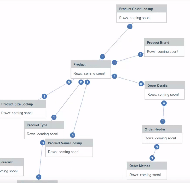
This is a completely web based tool, which is supposed to be simple enough for end users. In theory it should automatically determine how the joins should be built. See more here: https://www.youtube.com/watch?v=cYlbiWeBgtA

These datasets are designed to feed the new dashboarding system, which is truly impressive.
The dashboarding tool is obviously designed for analysts and end users. It does not offer the wide range of optoins and capabilities we’ve come to love in RS. However, it does many things that RS can’t do. The tool only works with the datasets, so the response time is fast – the data is already aggregated to the users needs and it’s automatically using DQM.

Drag in a measure, and it will create a block with that value. Drag an attribute on top of the measure, and it turns into a bar chart. Drag in another measure and it adds another bar, or add an attribute and it turns into a cluster or a scatterplot. We can turn this into another data container, like a list, with a simple right-click. Now for the interesting bit – drag in another measure onto the screen. The list just created will filter that measure. Just like the “Global Filters” from Workspace, you can filter any object by clicking on any item in that list. Furthermore, users can now drag in an iterator, similar to the item in Active Reports. But this one can automatically loop through members.

I can’t give it justice without an animated screenshot. Instead, just watch the video here: https://www.youtube.com/watch?v=bRbulHoUQC4

Navigating
The Cognos Connection screen is completely revamped. We won’t have the same system with tabs across the top and navigating folders. I’m personally sceptical of this, and nobody’s been able to give a satisfactory answer about where the tabs from C10 will actually go. This is actually my biggest concern when it comes to customer adoption.

The back end is mostly unchanged. Reports still use the same XML format, and the Cognos content store is (supposedly) still the same. This fact, coupled with the option to use the old Report Viewer, gives me hope that upgrading should be quick and painless.

On the non-Cognos-centric side, Watson is being pushed hard now. There’s even a way to import the results from Cognos reports into directly into the Watson web app. It seems to work through a CMS call through your browser. Lets say you have a list report. You provide the location for that report, answer all of the prompts, and your browser will run it in the background and send the results back to Watson. They warned that this can be very slow with large datasets. Stretch, walk around, get an expensive coffee from that little shop on the other side of town slow. Watson is now powering several different applications, some of whom were showcased throughout Insight. Research, shopping, travel, hospital, robots – there seems very little that Watson can’t do.

As usual, IBM Insight was a lot of fun and I strongly recommend attending. The networking possibilities alone are phenomenal, when coupled with inexpensive certification testing, and shiny toys (I got to fly a drone, and I saw a 3D printed car driven by a robot, and I got to play with a Van der Graaf generator, and probably a more interesting experiences I’m forgetting) make Insight a unique experience.

Addendum: My apologies for the lack of updates and replies to comments recently, my current client is taking all of my time. The current phase of the project is nearly over, so I’m going to soon have some time to go over my list.