Exposing Cognos content to the outside world

One of the greatest strengths of Cognos has always been the ease in which data can be managed, queried and presented. With a well designed data model, the barrier to building accurate reports is very low. For all of the fancy interactive features, neat tricks, and convoluted JavaScript techniques, the actual process of building a simple report to important information is very easy.

Now what happens if you want to build a portal to take that information and present it to end users. With a tool as complex and as extensible as Cognos, there are many ways of exposing Cognos to the world. What follows is a few, but Important Note! I am not factoring in licensing in this article. Licensing costs can often choose your solution for you. Letting the public use report studio will probably cost more than saving a report to PDF and manually attaching it to the website, but it’s ultimately down to your license agreement.

Schedule report runs to save to a folder. This is a simple idea. You build a report, schedule it to save to a folder, and run a process to upload it to your website. I’ve seen complex examples where a process scans the folder for new reports every few seconds and dynamically updates the website when it finds the output, to simple examples where the output report is dumped into an FTP site for people to download at their leasure.

Some sites simply expose Cognos directly to the internet granting visitors anonymous access. A simple google search will find you many examples of this. One example is The Office of Personel Management (https://www.fedscope.opm.gov/). Click on a data cube and you’ll find yourself using PowerPlay studio. No actual predefined reports to speak of here, but people who use it are probably more interested in using the slice and dice capabilities provided. The benefit here is obvious. It’s Cognos, pure and simple. All of the benefits, and drawbacks, of using Cognos are here.
FEDSCOPE allows anonymous users to use PowerPlay to research their data. Seriously, who users PowerPlay anymore? The Feds!

iFrames. You might be a government organization presenting offering reports through a complicated series of generated iFrames, such as found at the New Hampshire Department of Health and Human Services. Whan interactive dashboard is run (such as https://wisdom.dhhs.nh.gov/wisdom/#Topic_00FD0704951145F793A8C5424D352FBF_Anon), it loads several widgets talking to predefined reports. Each widget contains parameter information for Cognos to run and return the report, specifically for that widget. You could have one widget showing hospitalizations by day as a line graph, and another one showing fatalities by month; with both widgets pointing to the same report. This is a brilliant and extensible solution. It allows the dashboard developer to use the same reports multiple times. As each widget is an iFrame, the user has all of the capabilties in native Cognos. Drillthoughs, prompting, and any other feature report authors could put in. The drawback of this technique is that each widget does run a separate report, with all the overhead associated with it. If you anticipate a large audience, with thousands of hits an hour, this will cause system stability issues.
DHHS of New Hampshire has a pretty cool solution - each dashboard is a series of iframes that point to existing reports. URL params control what measures and dimensions appear, and those can be modified through prompts.

Mashup Services. I’ve been using Cognos Mashup Services (CMS) quite a bit lately. It’s an extension of the SDK that simplifies exposing Cognos reports as an API. There are many ways to use CMS to build your portal. A simple REST call and your pixel perfect reports, with graphs and formatting, can be returned in fully formed HTML and embedded directly in your webpage. The issue here is that all native Cognos interactivity is gone. No prompts, no drill downs. Any interactive features have to be built by default. But this may not necessarily be a bad thing. The Cognos outputs, while it can be coerced into looking nice, do not live up to modern web design standards. Features like sticky headers when scrolling down, or client side table sorting, or more info drawers or popovers, are difficult to build. By using CMS to generate your data in a compressed format, like JSON, you can merge the powerful querying engine with modern web design. Of course this is entirely predicated on you having web developers on your staff, or an application already set up to work with Cognos data. And speaking of which, I’ll revisit this one in the future.

So to summarize.
Scheduling a report – Simple, non-interactive, low cost. You need someone to set up the automation to get the output into the webpage, and then it’s fire and forget.
iFrames – Build the reports as normal, and use URL parameters to load it. As long as you have a report developer, this is the easiest solution. Some overhead on the server when running reports.
Mashup – medium to difficult. Any interactivity on the page needs to be coded in. Expertise will be needed to embed the output into the report. If you’re pulling HTML you can expect some unreasonably large results. Datset outputs, like JSON or ATOM, will need to have additional post processing.

Defining GMail as the SMTP Mail Server in Cognos Connection

In anticipation of some upcoming articles, I needed to set up an email provider. Because it’s so ubiquitous, and because I’m lazy, I’m going to use GMail as my SMTP server. Here’s what to do.

First, make sure you enable IMAP in the GMail settings. Click on the gear icon, settings, Forwarding and POP/IMAP, Enable IMAP, and Save Changes.

gmail settings

Now on GMail settings screen there a configuration instructions links for your applications, but for some reason Cognos isn’t listed. So here they are, in Cognos Configuration, open the Notification settings and set the following:

SMTP mail server: smpt.gmail.com:465
Account and password: Google account credentials
Default Sender: your own email
SSL Encryption: True

cognos connection. Now remember, you should use YOUR email, not mine. Mine is reserved.

Restart Cognos.

Now let’s set up a quick report to test the email.
quick and dirty report in Query Studio. A true masterpiece. Also, did I really need to tell people to restart? That should be obvious, right?

And run it…

Cognos report run page. I'm actually taking these screenshots as I'm writing the article. Hope it works.

Fingers crossed…

It works! I was actually worried for a moment. How embarrassing would it be if it DIDN'T work? I would have had to scupper the entire article! And since I have so many planned, this would have been horrible.

Obviously this shouldn’t be used for a production environment. There are also a few Google set limitations, the biggest of which is a 99 email limit per day – so no crazy burst jobs. This is really good for a quick and dirty example.

If I find the time this year (no promises), I’ll be writing about setting up dynamic email subject lines, and different report outputs in a single email. Another article I’m planning is a combination of the data entry method and bursting.

A few Report Studio tricks

Building reports in Cognos can be a fairly arduous process. A mistake early on in the development can cause some headaches later on. Quickly and efficiently building reports is best, but what if you have to go back and fix something?

Fixing Extended Data Items

One of the most common problems I run into is people using extended data items to build a dimensional report. Once the data item has been created, it can’t easily be changed. What if you need to change the level, or even hierarchy, the item is based on? You’ll need to delete and rebuild it from scratch. Instead it would be easier to convert it to a full expression.

There is a function that allows this, but it is normally inaccessible. We can easily reveal it by using the developer toolbar in Report Studio. I prefer using Firefox, that’s the browser in the animation. Simply copy the following code into the console and run it.

document.getElementById('mnuToolsPopup').firstChild.firstChild.appendChild(document.getElementById('mnuConvertV5DataItems').parentNode.parentNode)

Convert to V5 Data Items

As you can see in the animation, the option magically appears under tools, and will convert every extended data item into a normal data item. It’s worth mentioning that this is not supported by IBM, and it is not possible to convert data items back into Extended Data Items, so tread carefully with this.

Avoid Extra Master/Detail relationships by using list headers

I’m not a big fan of using section functionality. It works by creating another list, a list in a list, connected with master/detail. In some cases Cognos can handle this efficiently; with master detail optimization and efficiently built queries. In most cases however, Cognos will generate an extra query for each separate detail.

How can we avoid this? By careful grouping and setting of list headers/footers, we can replicate the appearance of a sectioned report. In the image below, we have two identical looking lists. One is using the default section function, and one is some very clever formatting. Can you guess which is which?

List Headers vs Sectioning

Year grouped, removed from the list, headers and footers set, list header set to “start of details”, and extra rows/fields included for the padding effect. All small details that go a long way into making things look right.

The report xml is attached below, but can you figure it out yourself?

Caching charts to speed up run time

This is actually something I’m not too proud of. At my current client we have a few reports with embedded graphs. Hundreds upon hundreds of embedded graphs. Each graph can take around 300 ms to render. This increases the runtime of the report from 30 seconds, without graphs, to around 9 minutes. How can we get around this? Well, in this case, the graphs were fairly simple – a colored bar showing 0-100% against a light gray background. There are a few different variations – a 12 pixel tall vs a 6 pixel tall, and depending on the type it can be blue, green, or purple. In total there were 606 possible graphs (it’s actually 602 as the 0% graphs all look identical, but let’s not get technical here).

To start, the names of the graphs had to be consistent. Bar55B.png would be a bar set to 55% and is colored Blue. We can then use an image item with the source set to layout expression. ‘\images\charts\Bar’+number2string(floor([Measure]*100))+’B.png’. Each row would generate the image tag, and wouldn’t have to take the time to actually build the graph image. But how can we generate those images?

The easiest way is to use a numbers dimension. Don’t have a numbers dimension? Use a date dimension – you just need to massage a date dimension to work the way you want. For example, on the samples I’m using _days_between([Sales (query)].[Time].[Date],2010-01-01) and filtering that <=100. Build the graph in each row, and run it to make sure. The output should look like this: graphs

But saving each of those images would be tedious, so how can we automate it? Modern web browsers have a number of options. I’m using an addon called Save Images which will automatically save each image from the tab to a specified folder. This addon will number the images starting at 1, so it’s important to sort the list so the 0 is at the very end. This way you can modify Bar101 to Bar0, instead of having to subtract 1 from each graph. The addon saves and names the images in the order they appear in the output, so it works well for this purpose.

save images

Once the images have been saved, we need to do a bit of post processing.

First, rename Bar101 to Bar0. Now let’s notice something interesting the height of the image is 16, but we need 6 or 12. To fix this, we can use a batch image processor. For this we can use an application like XnConvert. With XnConvert we can modify the size and colors of the graph. The color picker offers a number of ways of selecting the desired colors, including a color picker.

Simply select the color to change and the color you want.
xnconvert colors

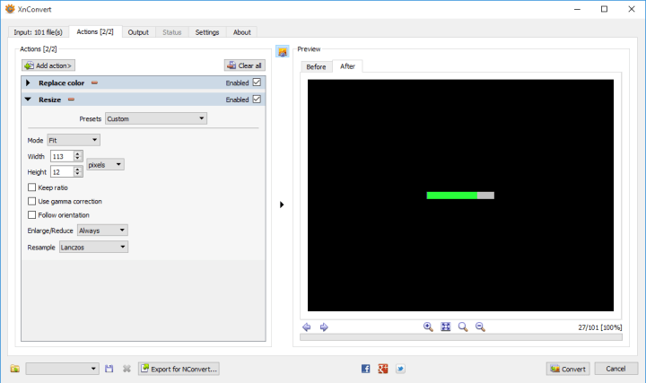
Next we resize
xnconvert resize

Finally, renaming:
xnconver rename
This will take the original name, BarN, append GL (green large).

And when we press the convert button…
xnconver rename

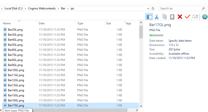
We can repeat, very quickly, for every variation we need. In my case it only took 6 rounds of changes, about a minute in total.
xnconvert done

Now instead of relying on Cognos to generate hundreds (if not thousands) of graphs, we simply use an image item with the source set to a report expression.
‘..\images\Bar\ipr\Bar’+number2string(floor([Query1].[Percentage]*100))+[Color letter] +[Large or Small]+’.png’

The difference in runtime is phenomenal. First we don’t have a master/detail relationship any more. So that’s an additional N db connections that aren’t being run (yes, I know M/D optimization negates that, but that only works in DQM and it’s spotty). And most importantly, that’s thousands of images Cognos doesn’t have to generate (300 ms * 1500 images = 7 minutes).

section-or-formatting.txt (723 downloads)
graphs.txt (642 downloads)